| Year 2018 |
Categories UI/Visual Graphic Design Identity |
The original design challenge asked for the design of three pages:
- 1. Home page
- 2. ‘Paintings’ (highlights tab)
- 3. ‘Mona Lisa’ detail page
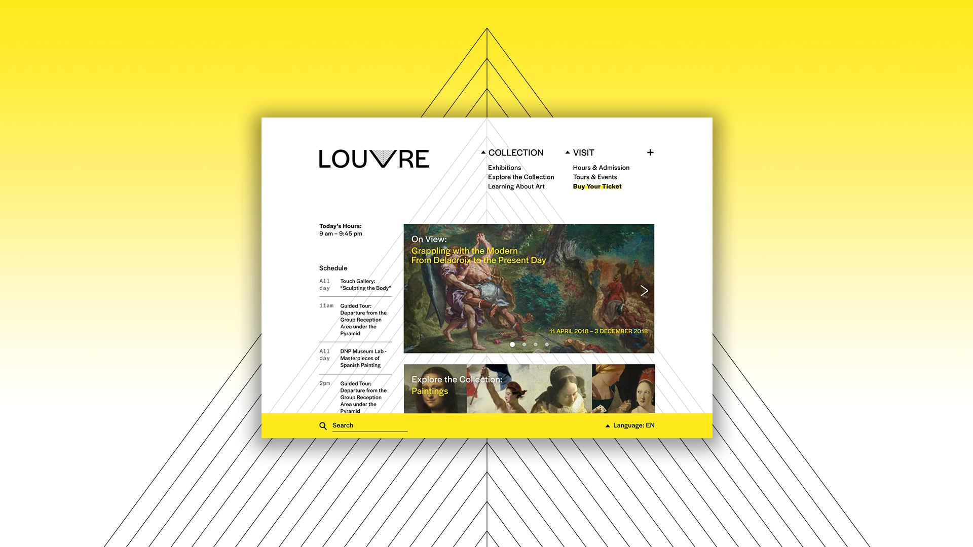
My first impression on the Louvre's existing site was: clutter. I began by selecting the most essential information for visting a museum's website, which I separated into what people want to find online (a "URL" visitor) versus what people need for a physical experience (an "IRL" visitor).
As an institution visited by international visitors of all ages and website proficiency, the re-design needed to include: language accessibility, shortcuts for direct paths, and visually prominent imagery.

An essential element in this redesign is the main navigation menu:
↑ Demo of nav and footer animations while page scrolls. Navigation menus shrink into a bar on top, and the logo becomes centered in the footer.
One of the pain points in the current version of the Louvre's website is navigating the digital collection (which is a key part of the site). Users currently have to click through page by page to find the work they want, or somehow know the specific page number of the painting they're looking for.
To address this, I designed an interface in which users can sort through artwork by title, date, artist, or popularity. This includes an alphabet scroll bar on the left that allows users to locate where they are in a page, or jump to a letter quickly:

↑ Sort by Title on left; sort by Artist on right.
The painting details page is a pop-up of minimalist design that focuses attention on the artwork, with a reorganization and reestablished hierarchy for details such as artist name, title, material, date, and descriptions.

↑ Mockup of mobile homepage for iPhone.

↑ Alternate pages in mobile view.
For the identity, I wanted to draw attention to an iconic feature of the museum: I. M. Pei's Pyramide du Louvre. The geometric shape of the structure translates well into a graphic, which is also partly inspired by the responsive mark that Experimental Jetset created for the Whitney.

↑ Wordmark and logo explorations. (5) represents the final option, with fewer lines in the "V" for better visibility across all sizes.
The typographic choice of Halyard Display also reflects the desire to "modernize" the look of the Louvre, while maintaining legibility with a neo-grotesque sans serif. Headings are typeset in Big Caslon to create contrast with a serif that has similar proportions.

↑ The large version of the pyramid serves as a background, a more abstracted iteration than the pyramids in the wordmark/logo.
Because the current Louvre website contains a cacophony of color, and because the artworks displayed themselves are also rather "noisy," I chose to focus on one key color for the website:

↑ Color was inspired by the rich gold in the famous Golden Room. However, since gold cannot really be communicated on screen, rather than using a muted brown, the final yellow was a choice that works specifically in the digital space.